
网站用户体验
Your website is the core anchor for your digital marketing efforts. Designing a great website user experience requires understanding the problems different visitors have to solve.
In today's marketing landscape, your website has become a more powerful tool than ever. Your website is a 24/7 salesman, and as such, it has the potential to be your most powerful asset and the centerpiece of your marketing efforts.

但是,快速变化的数字趋势会使您的网站感到旧和过时。虽然有时重新设计可能是理想的选择,但您可能没有时间或金钱投资于如此大的项目。为了帮助您克服这一挑战,我们汇总了您可以改进网站的10种简单方法的列表,以使其更有帮助和有用。
如何改善网站
- Use white space.
- Optimize your page speed.
- Use attractive calls to action.
- 使用超链接分化。
- Segment key information with bullet points.
- Use images (wisely).
- Include well-designed and written headlines.
- Keep your website pages consistent.
- 抓住你的404。
- 响应迅速且对移动设备友好。
Your website is the core anchor for your digital marketing efforts. Designing a great website user experience requires understanding the problems different visitors have to solve.
1. Use white space.
在不止一次的情况下,我听说客户抱怨他们的网站上有太多的空白空间,并且该未使用的房地产应该用于广告更多的服务。但是,白空间对于良好的设计至关重要。空白使您的内容更加清晰,同时还可以使用户专注于文本周围的元素。
根据Crazy Egg, white space around text and titles increases user attention by 20%. White space can also make your website feel open, fresh and modern and if your branding is consistent with these then it can help you communicate that feeling to the user. One downside of white space to keep in mind, however, is that it does indeed take up space.
如果您试图在折叠上方获得很多内容(在不滚动而不滚动的零件上方的零件上方),那么空间过多的空间可能会替代一些有价值的信息。关键是要在顶部交流最重要的东西之间找到平衡,并在其中围绕一些空间来突出图像和/或文本。
考虑网站,Sara Does SEO, by Sara Dunn. In her UX, there is a lot of white space right from the start, pulling your attention to what Sara looks like and what can do for you. This allows the reader to focus her attention on the most important things. Each section of the homepage also provides one clear header and a few supporting points, making it easier to digest information.
Check out her website below.

2. Optimize your page speed.
One of the most frustrating experiences for users of the web is waiting for a page to load for too long. With the rise of the mobile devices, people are accessing content all over the world on many different platforms. While browsing online at Starbucks or while watching TV on their laptop, they expect a fast result for the content that they want.
When they don't get it, they usually bounce. Slow page load is an interrupting experience for the user and it can be a source of frustration and often users simply don't have the time to wait.
根据部分, an extra five seconds of page load time can increase your website's "bounce rate" by more than 20%. Whoa.
So, where do you go from here? Get your score. Google提供免费服务where you can get information on your page speed. Google will also offer you some suggestions for improving your load time on Mobile and Desktop.
To improve your page speed, start by compressing all your images before loading them onto your website. Image file size is one of the leading causes of a slow page speed -- using websites likeCompressor.io可以帮助您大大加快自己拥有的每个网页。
Learn more about decreasing your website's bounce rate inthis blog post。
A great example of speedy load is Barnes and Nobles. No matter what device your own Barnes and Nobles loads quickly. Taking the extra caution to load some important elements first so that you know that the content is on its way.See for yourself。
3. Use attractive calls to action.
Your customers are already accustomed to following visual cues to determine which content is important to them. Calls to actions (CTAs) that are clearly marked with an action word enable your website users to more easily navigate your site and get exactly what they want in the location they expect to find it.
In creating buttons for your website you should think about color and the psychology of color. In a study done by Maxymiser, researchers were shocked to find that hey achieved an increase of 11% in clicks to the checkout area of the Laura Ashley website, by testing color variations and action messaging. Different colors evoke different messages. Think about the message that you want to evoke for a user (trust, experience, intelligence) and choose your colors wisely.
A second thing to consider is the actual words you use for your buttons. The words should include a verb or an action word that excite the user todo something。Choosing the right words or psychological triggers is highly determined by the level of emotional identification that word prompts. No emotional connection means no action. So make your words bold, time sensitive and action-oriented.
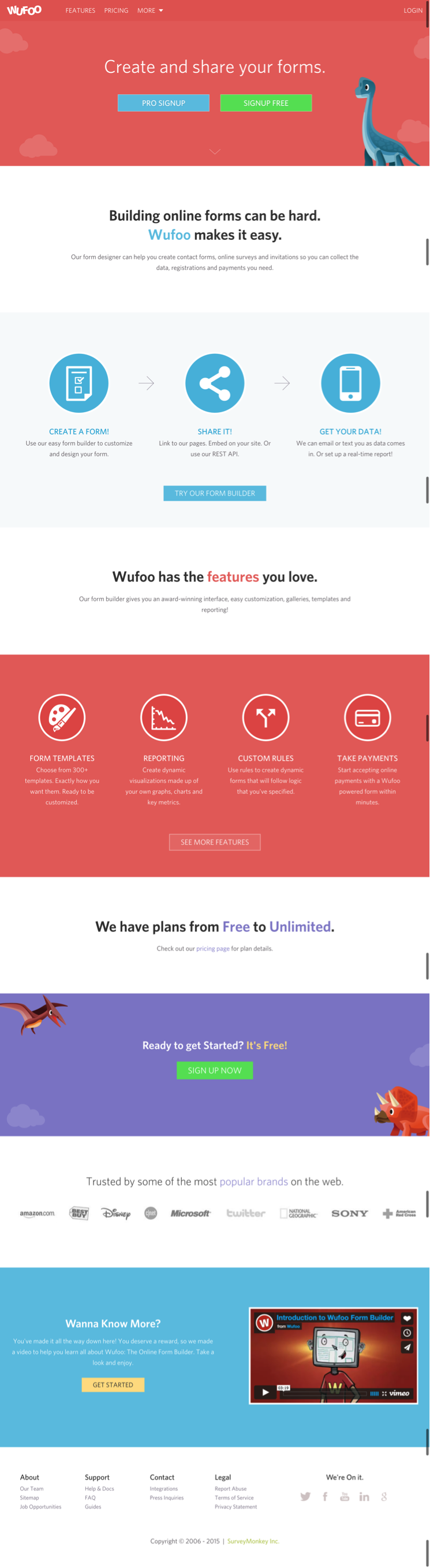
A great example of the good use of calls to action isWUFOO。The company's entire page is action-oriented and uses buttons to encourage the user to go to the next step. At the end of the page, you'll see the use of time-sensitive language like "Sign Up Now" and action-oriented language like "Get Started." These are active action words that prompt and guide the user to move forward.
4. Use hyperlink differentiation.
When you add a link to any page, you're saying you want the user to click there. Make sure links are easily identifiable by visual cues. Underlined text and differently colored text draws the attention of the reader and lets him or her know this is a link to be clicked on.
Ina studydone by Karyn Graves, she shows that the regular web user sees blue and underlined text as links and knows to click on them. Exploiting user expectations and what they already know about using the web is tantamount to success.
在超链接区分方面,您无需重新发明轮子。坚持会议可能是您最好的盟友。测试链接有多么有效的简单方法是模糊和删除设计中的颜色并查看脱颖而出。
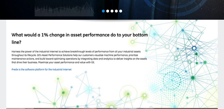
When hyperlinking, also stop to think about the length of the hyperlink. The longer the link titles the more easy to identify they are.For example: "To check out the GE Website clickhere。“vs。“Check Out the GE Website here.“
5.将关键信息分割为子弹点。
项目符号将使用户能够快速获取所需的所有信息:好处,解决问题的方法以及产品/服务的关键功能 - 所有时间都在很短的时间内。这将使您的主张更具吸引力,并使您的用户能够获取所需的所有信息。此外,您不必以简单的圆圈走传统的路线。
With tons of cool icons out there, you can also get creative with your bullet and help the reader further with images that represent your point. Why do this? Because it forces you to isolate the most important points you're trying to make without getting caught up in terminology or specifics.
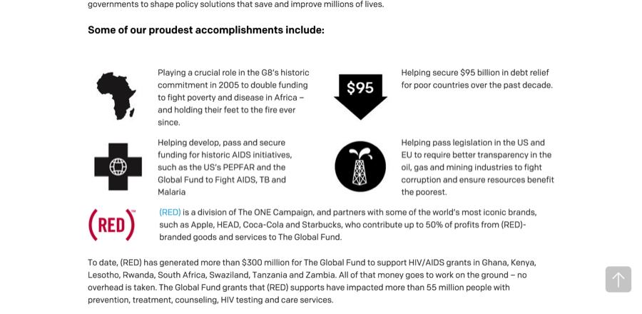
一个很好的例子,非常规子弹来s fromOne.org。在此页面上,他们使用图标作为子弹来以易于阅读的方式突出其成就。另外,请注意子弹周围的空白,使您可以专注于每个部分。
 Read the full study here。)
底线?而stock photography can be high quality, it fails to create a connection between the user and the brand.
Ultimately, no stock photography will be as capable of conveying你的品牌、服务和产品的方法t to. Only your own actual images can do that while also speaking clearly to your potential customer. Use images strategically and place them in your website to support the content and allow the users a visual break from text, but make sure they are relevant and non-generic.
Check outthis infographicon real images versus stock photography.
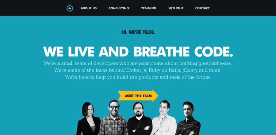
 Tilde。Here you can see that the headings stand out in size and color and accurately describe the content that follows.
8. Keep your website pages consistent.
Consistency means making everything match. Heading sizes, font choices, coloring, button styles, spacing, design elements, illustration styles, photo choices -- you name it. Everything should be themed to make your design coherent between pages and on the same page.
In order to provide your user with a beautiful experience as they navigate through your site, it is important that they know they are still in your website. Drastic design changes from one page to the other can lead your user to feel lost and confused and to lose trust in your site.
“我在正确的地方吗?”是一个问题,我经常发现自己问何时在不一致的站点中导航,而当我这样做时,我通常会离开。用户说,设计的不一致降低了您提供的产品和服务的质量。
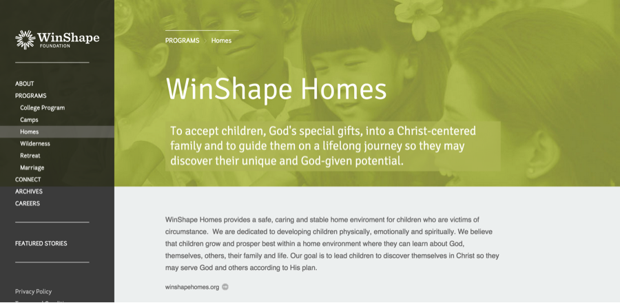
Winshape Foundation is a great example of consistent design. All of its pages follow one common pattern: navigation on the right, big header, sub header with a background image and some content below. I know that no matter where I click, I'm still on their website, as all their styling is consistent.Check it out here。
 9.抓住您的404。
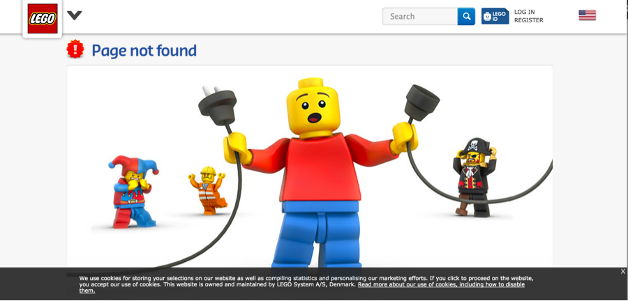
而search engines don't punish you severely for soft 404 errors (page not found), a user will. When a user approaches a link or an image, they are expecting this link will take them to the next place they want to go.
Simply put, encountering a 404 error page annoys your user, and makes them rethink spending their time on your website (when they probably could go elsewhere for a faster solution). Next to slow page load time, running into 404s is another highly frustrating event for a user and it completely disrupts their journey throughout your website.
要检查您是否有404,可以在网站上设置Google网站管理员工具并检查爬网错误。Here's how。You can also use thisfree 404 checker。
As an additional resource, you can also make sure that when your user lands on a 404 it provides them with the option to get back on track.Check out these cool examples of 404 pages.
 you can use this free tool.
I hope these tips have given you some ideas on how you can revamp your website to be more user friendly without shelling out the dollars on a complete redesign. To see more examples of useful websites, check out our free guide below.
 Originally published Oct 28, 2018 9:25:00 PM, updated December 04 2020